A portfolio rebuilt to explain multidisciplinary work
The Previous Portfolio Set the Foundation
Built in Webflow with a designer friend, the previous portfolio created a strong visual index for a multidisciplinary practice. Its grid and bottom navigation gave the work a recognizable home and served the collection well at that stage.
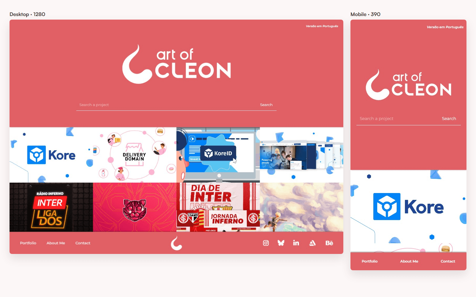
The previous portfolio used a bottom navigation on desktop and mobile.
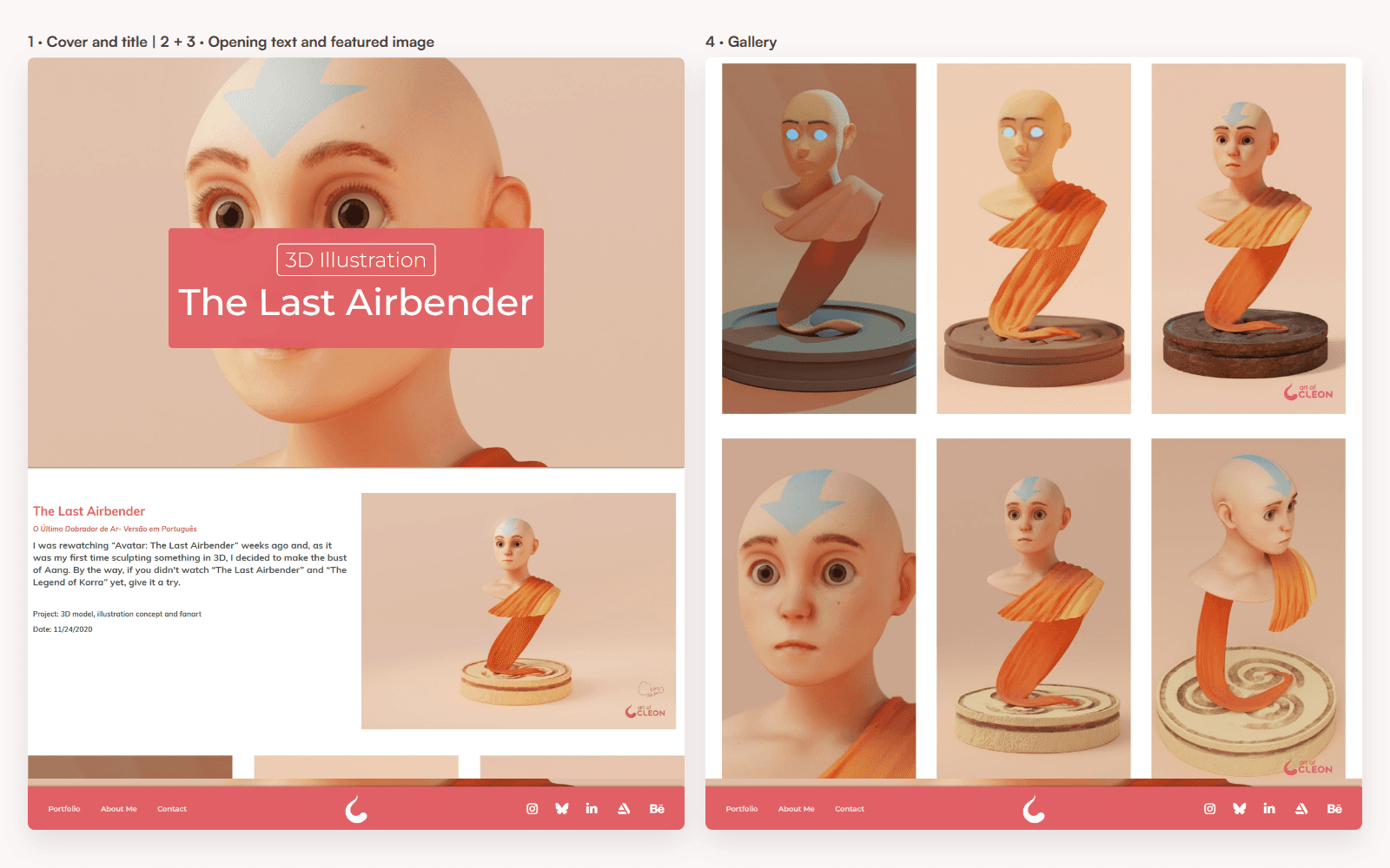
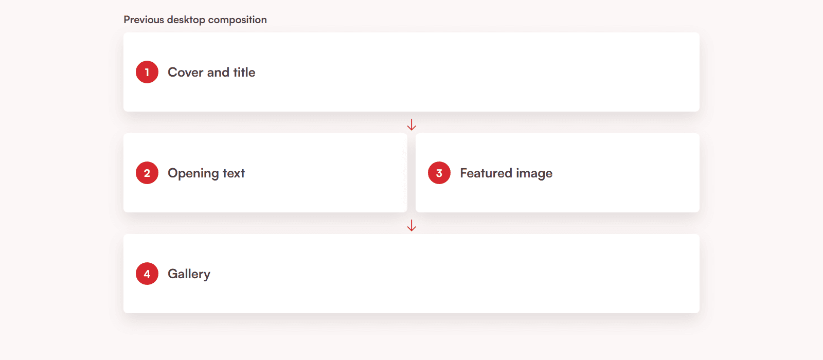
The opening text and featured image shared one desktop row. The gallery continued below as the final stage of the project page.
Each project used a clear sequence: cover, opening text, featured image, then gallery. As the body of work grew, the next iteration extended that foundation so context, comparisons, and interactive evidence could appear where each story needed them.
From a Figma Prototype to a Published Portfolio
I began the redesign in Figma in mid-2025, then paused it while work responsibilities took priority. I returned to it in 2026 with enough time to test the direction as a responsive product rather than treat the Figma file as the final result.
Figma established the initial visual direction. HTML prototypes created with Claude exposed interaction and responsive problems. Claude Code and Codex helped move the work into Framer, where the site and CMS became the product. Storybook came later, once there was a component system worth documenting.
The Homepage Became a Hub
The first homepage direction used a six-slide carousel. It already supported pause, keyboard navigation, and reduced motion, but the introduction changed according to the moment someone arrived. In the current hero, “Product Designer for B2B platforms” stays on the left. The right side still moves, cycling through selected work.
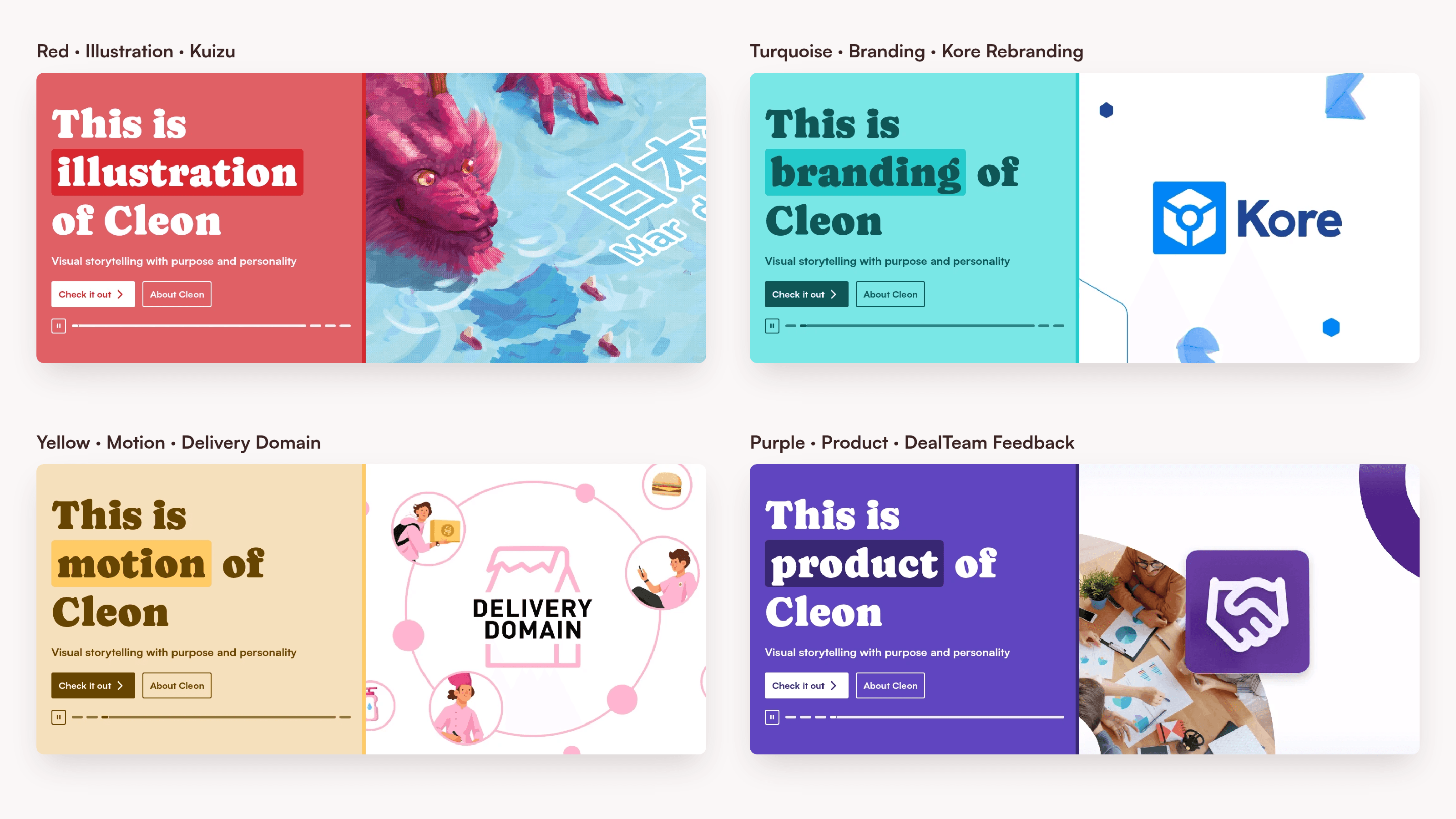
One four-slide carousel shown at positions one through four, with each variant labelled above and the progress control advancing in the same order.

The published homepage keeps the “Product Designer” position fixed while selected project work continues to rotate on the right.
The wording does two different jobs. “Product Designer for B2B platforms” gives recruiters and product teams a clear professional position. The line underneath, “Designing how ideas look, work and move”, leaves room for the wider practice without competing with that role.
That decision shaped the rest of the Home page. “Featured work” gives one case more space and places two others beside it. A short transition then opens the view to the rest of the practice, followed by two prominent category routes and four smaller ones. The page ends with a direct contact invitation.
The taxonomy changed as well: “UI/UX” became “Product” because the cases extend beyond interface execution into systems, behavior, and product decisions. “Product” leads and “Branding” follows, while “Illustration”, “Motion”, “3D”, and “Graphic” remain destinations in their own right. Categories and search make those routes available without asking every discipline to compete in the hero.
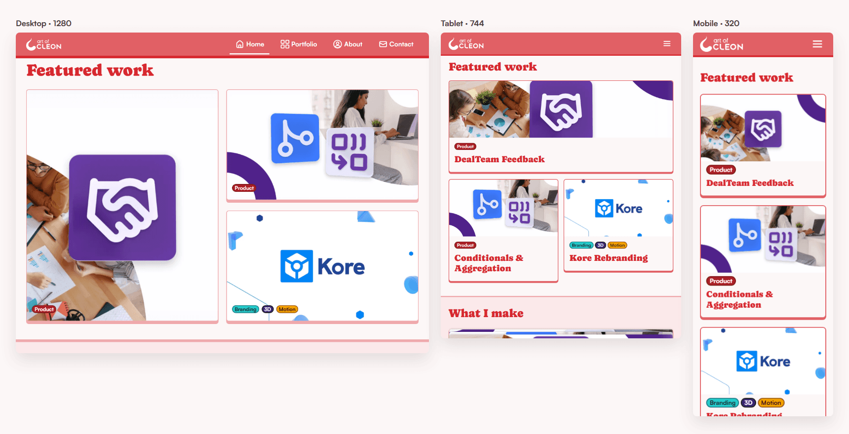
The production interface changes structure at 1280, 744, and 320 pixels.
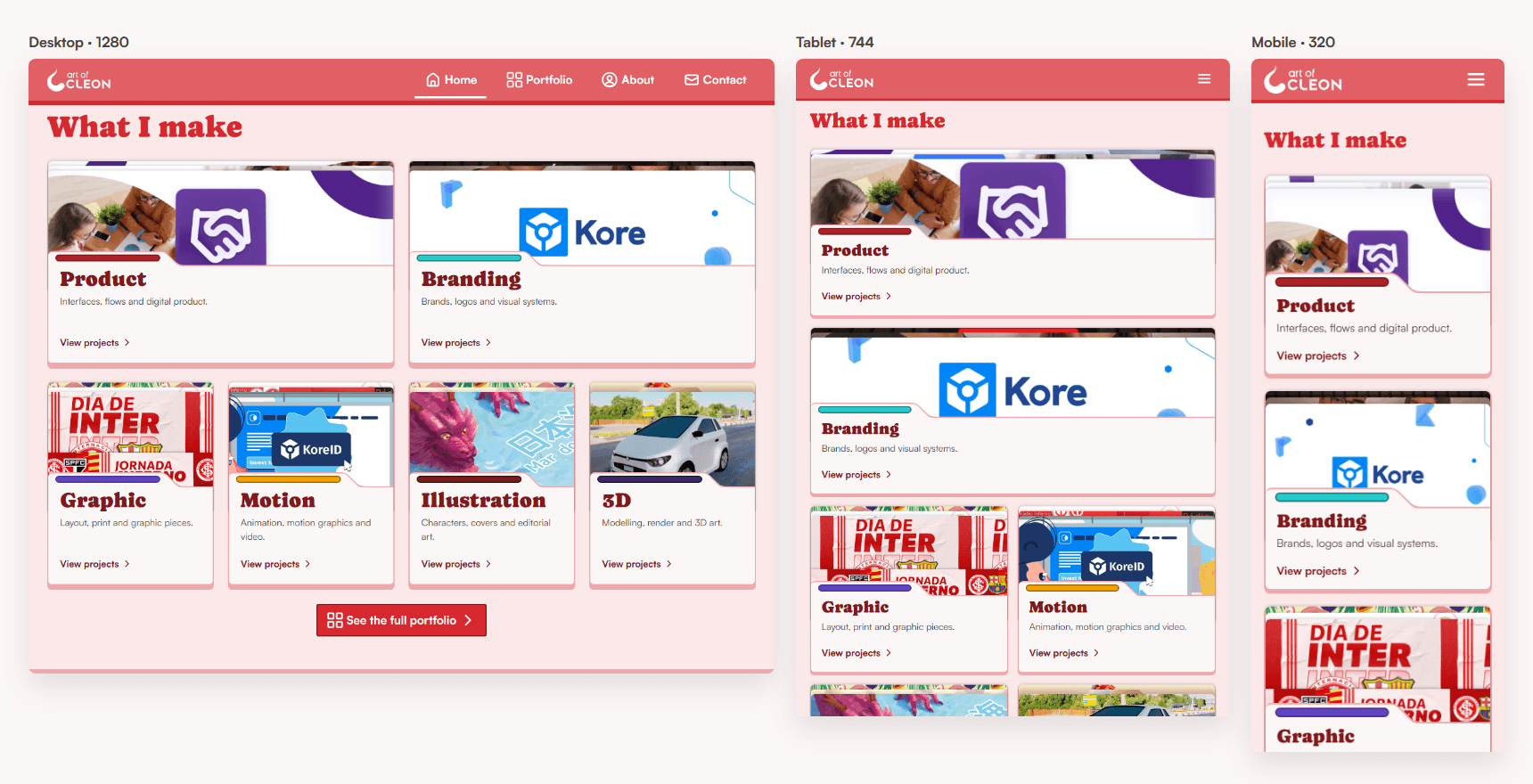
Category routes keep the wider practice discoverable after “Featured work” establishes the primary positioning.
One Content Model Supports Different Kinds of Work
The new CMS keeps shared project data in the template and leaves the case narrative flexible. Each project begins with a consistent hero for its thumbnail, name, categories, client, sector, date, software, and collaborators. The body can then combine text, images, video, comparisons, prototypes, and 3D in the order the story needs.
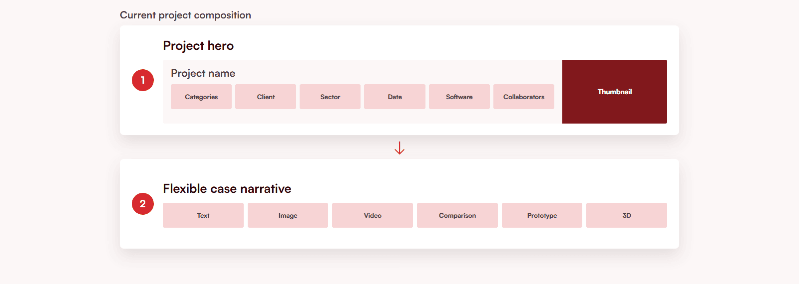
Preparing the portfolio required returning to briefs, source files, process images, and original videos. The goal was to provide enough evidence to explain problems, decisions, and consequences without forcing every project into the same sequence.
Four Themes, Selected Per Project
A project category does not determine its theme. Red, turquoise, purple, or yellow is chosen for the visual context of the work, while the interface continues to rely on one set of component contracts for typography, spacing, shadows, navigation, buttons, forms, cards, and focus states.
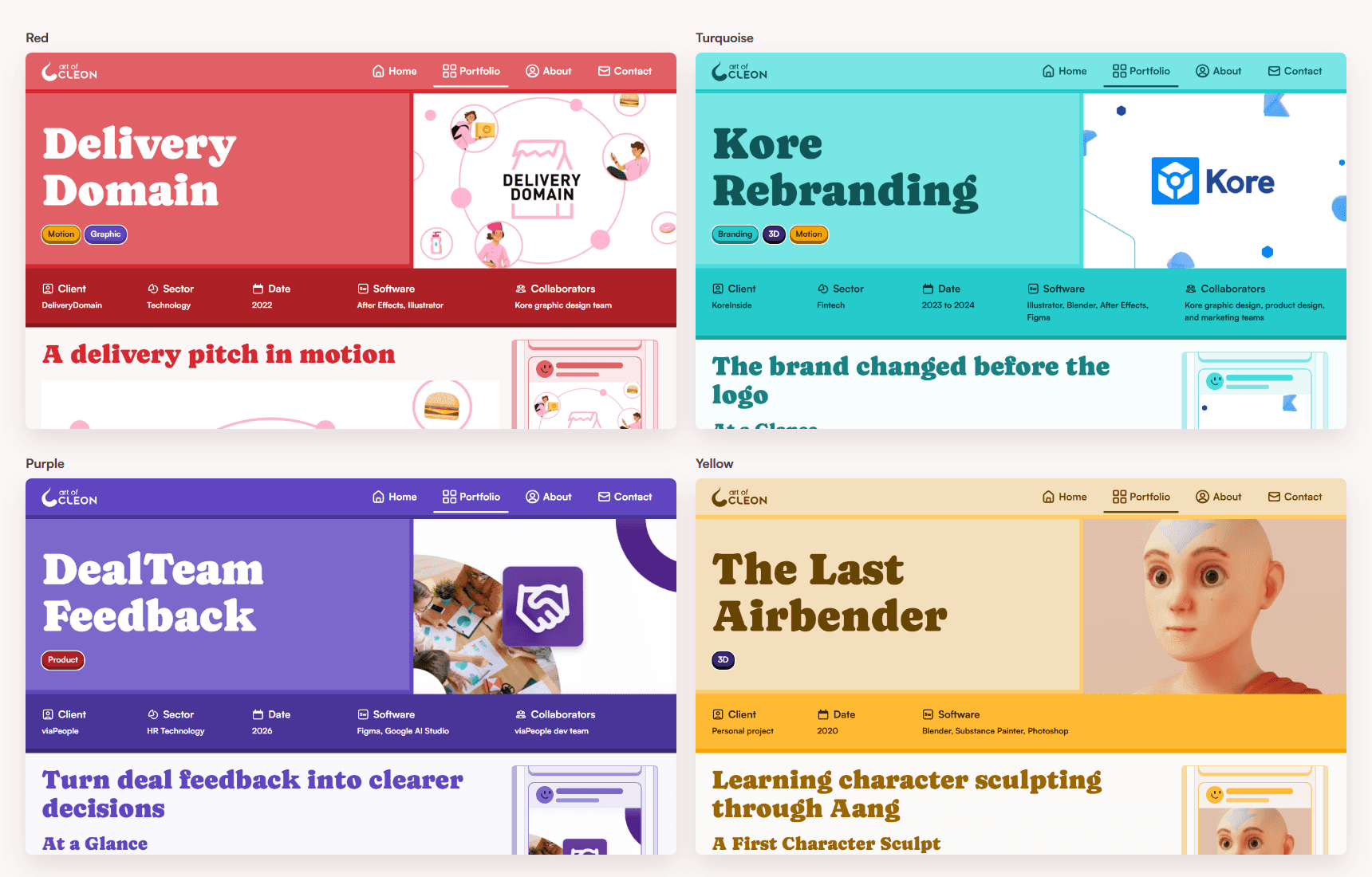
Four published projects show the same hierarchy under different project-selected themes.
A Visual Language Built in Layers
When I began exploring a new portfolio in 2025, I experimented with shadows as a way to give the interface depth. I wanted something more defined than soft, diffuse elevation. Crisp, offset shadows could make the Navbar feel like a piece resting above the page. Cards and controls could feel cut out, placed, and assembled, with color and strokes making the edges of each piece visible.
The result shares visual cues with neobrutalism: saturated color blocks, pronounced outlines, direct shadows, and expressive typography. I used those cues to develop an identity of my own, not to reproduce a style. Caprasimo gives key moments their graphic character, while Satoshi keeps longer passages clear. Rounded forms and project-selected themes add warmth and variety.
That sense of assembly became a way to judge the details. A shadow needed to make the relationship between pieces clearer; a strong color needed to support hierarchy, not compete with the work. The same care carried through the responsive layouts and interaction states.
Accessibility and QA Changed the Design
Accessibility work changed interactions as they were built. Across the four colour families, contrast and focus had to remain clear. Motion, icon-only controls, touch targets, fullscreen prototypes, scroll locking, Escape behavior, and focus return were reviewed as parts of the same flow.
Testing at 320, 744, and 1280 pixels changed layouts that initially looked resolved in a single frame. Real CMS content exposed truncation and spacing failures that placeholders hid. Route matrices, keyboard tests, constrained-network checks, and publication guards were added to reduce regressions.
AI Expanded What Could Be Tested
I used AI to prototype, inspect, implement, measure, and document the work. I remained responsible for direction and approval. That meant revising results that functioned technically but missed the design intent: the carousel weakened the positioning, card hierarchies broke at narrower widths, and compact controls needed more work for touch and keyboard use.
Launch Created a Baseline
After launch, Google Analytics, Microsoft Clarity, and Framer Analytics establish the baseline. Performance, route behavior, and conversion are recorded with the relevant URL, device, network, cache condition, release, and sample size before any conclusion is drawn.
The portfolio now gives the practice a clear entry point while preserving routes into its supporting disciplines. Analytics and QA provide evidence for the next iteration.
Explore the Design System
The Component Explorer below documents themes, device widths, labels, content states, and focus behavior.