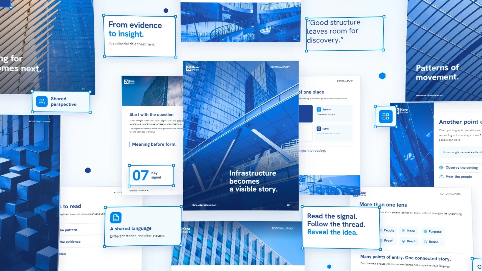
The library behind the page
From identity to editorial language
KoreInside’s identity had shifted toward a deeper blue and more photography as it began speaking to a more institutional B2B audience. My job was to carry that direction into long brochures without forcing every document into one template.
Researching the page as a system
I started with KoreInside’s Figma foundation and used Claude to generate HTML/CSS prototypes and rendered page studies. I compared ways to place images, structure evidence, and pace the reading, then revised the patterns that held up. I chose the direction and checked the outputs against the system’s visual rules.
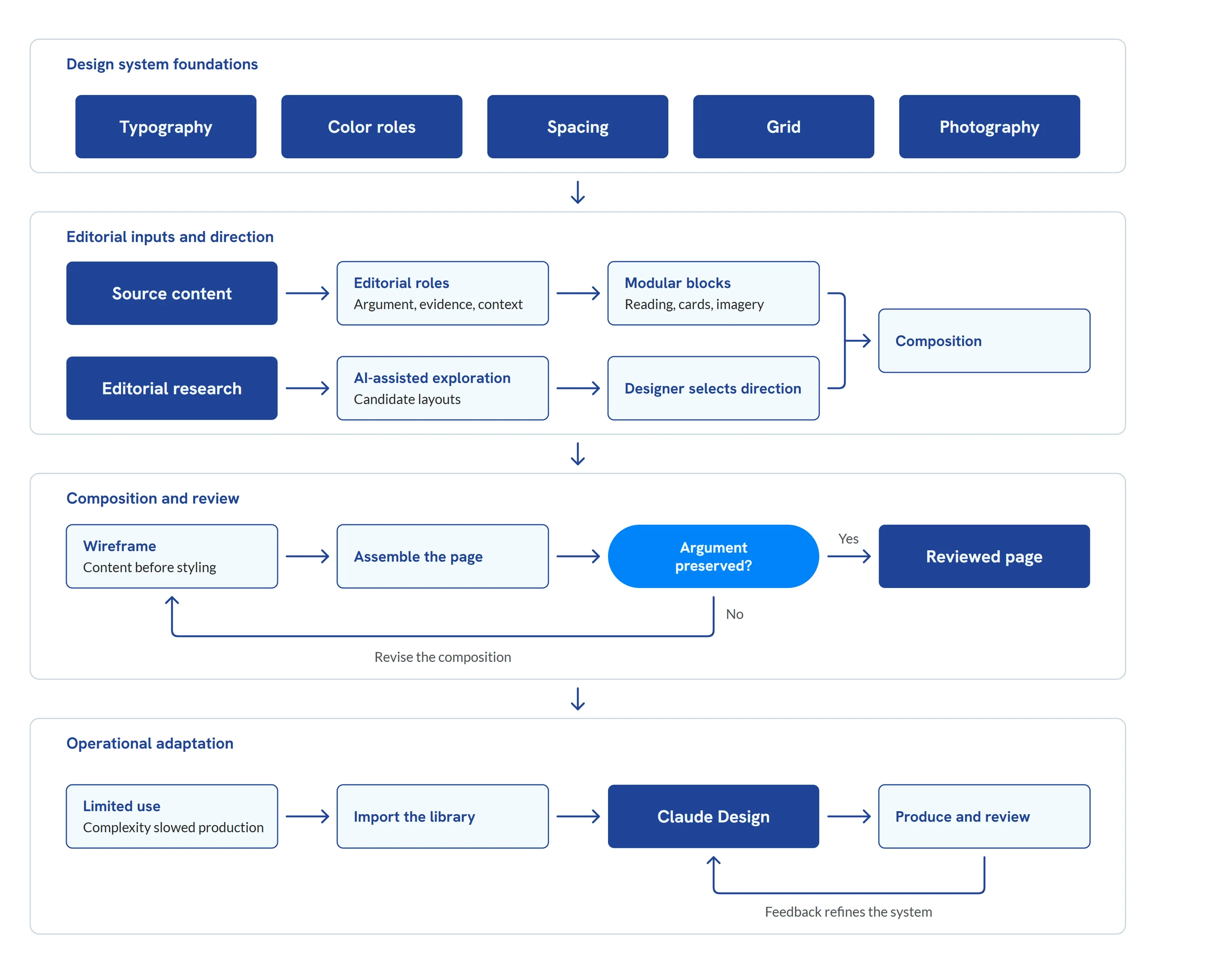
The map separates AI-assisted exploration from my design decisions and review, then shows the library being imported into Claude Design for production.
The component library
I grouped the components by editorial job: reading, emphasis, quotations, lists, cards, data, imagery, and page structure. That let me choose a block from the content’s needs instead of starting with a fixed page. The specimens show the documented options, including treatments that stayed proposals.
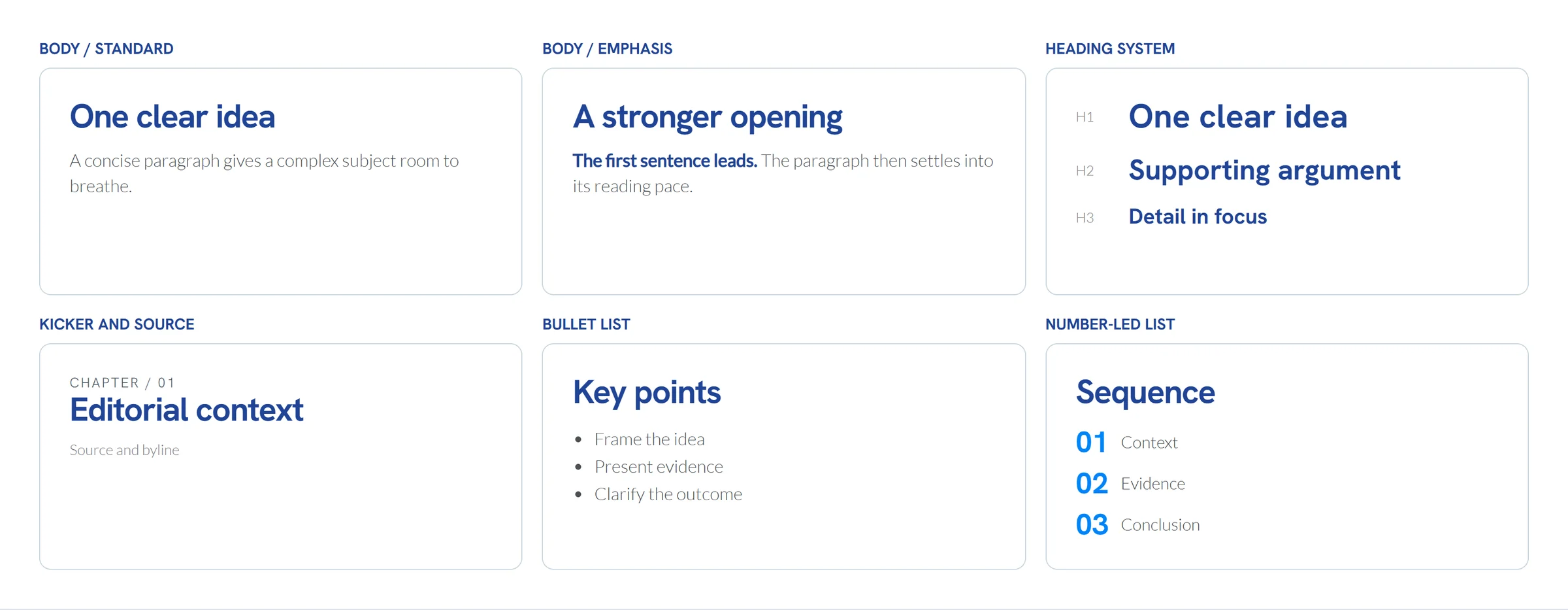
Top row: standard body, emphasis, and H1–H3 hierarchy. Bottom row: kicker and source, bullet list, and number-led list. Type is enlarged for portfolio viewing; font roles follow the documented system.
Card anatomy and treatments
I kept offset outlines for a single card that needed to stand apart.
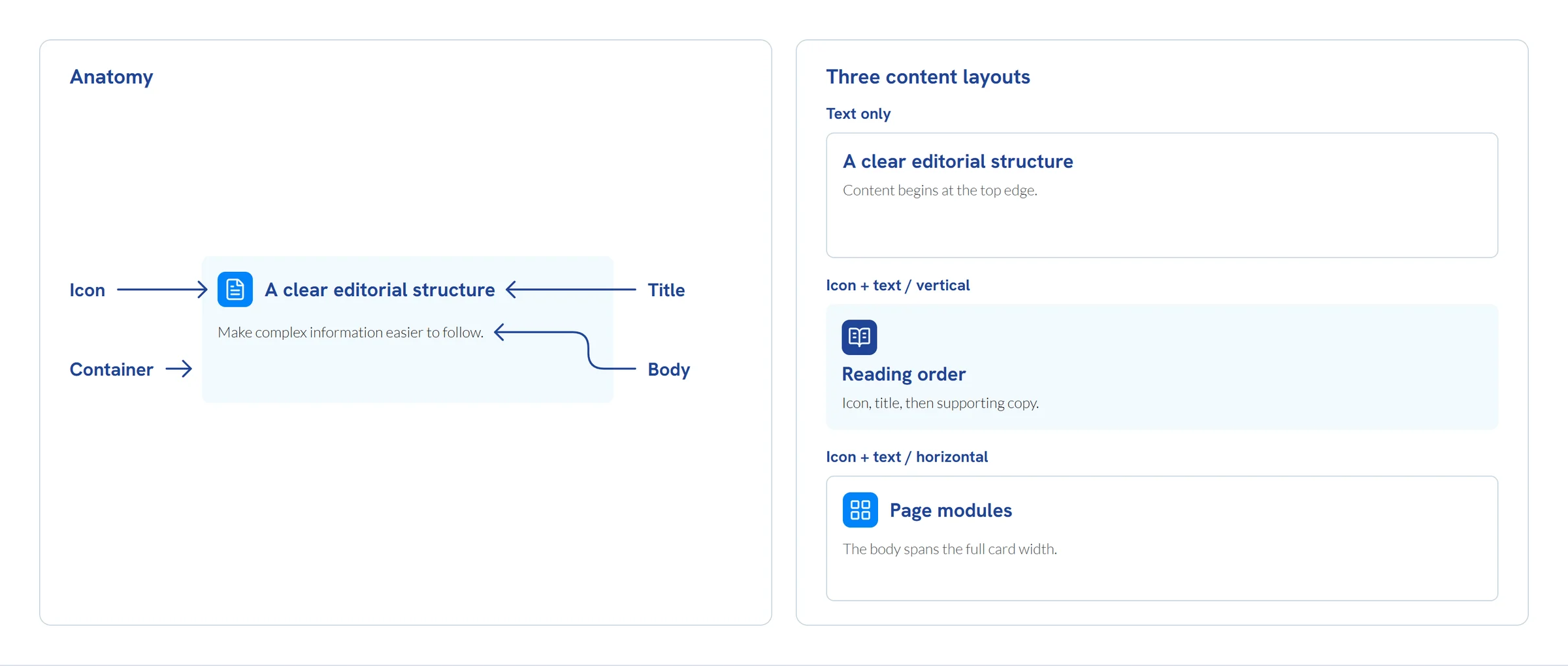
The card combines an icon, container, title and body, with 16 px padding and an 8 px radius. Lucide icons use ghost or filled-box treatments; titles use Hanken Bold and body copy uses Lato Light. At right, from top to bottom: text-only, vertical icon-and-text, and horizontal icon-and-text layouts.
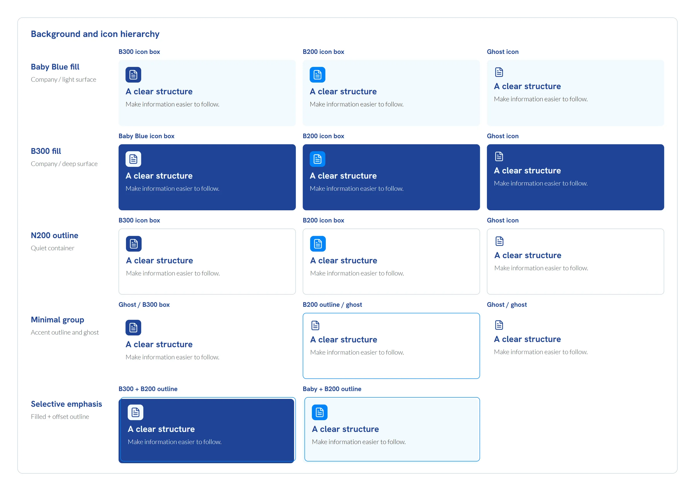
Fourteen treatments are grouped by surface and icon hierarchy. Specimen copy stays constant to make the differences visible; offset outlines are reserved for selective emphasis.
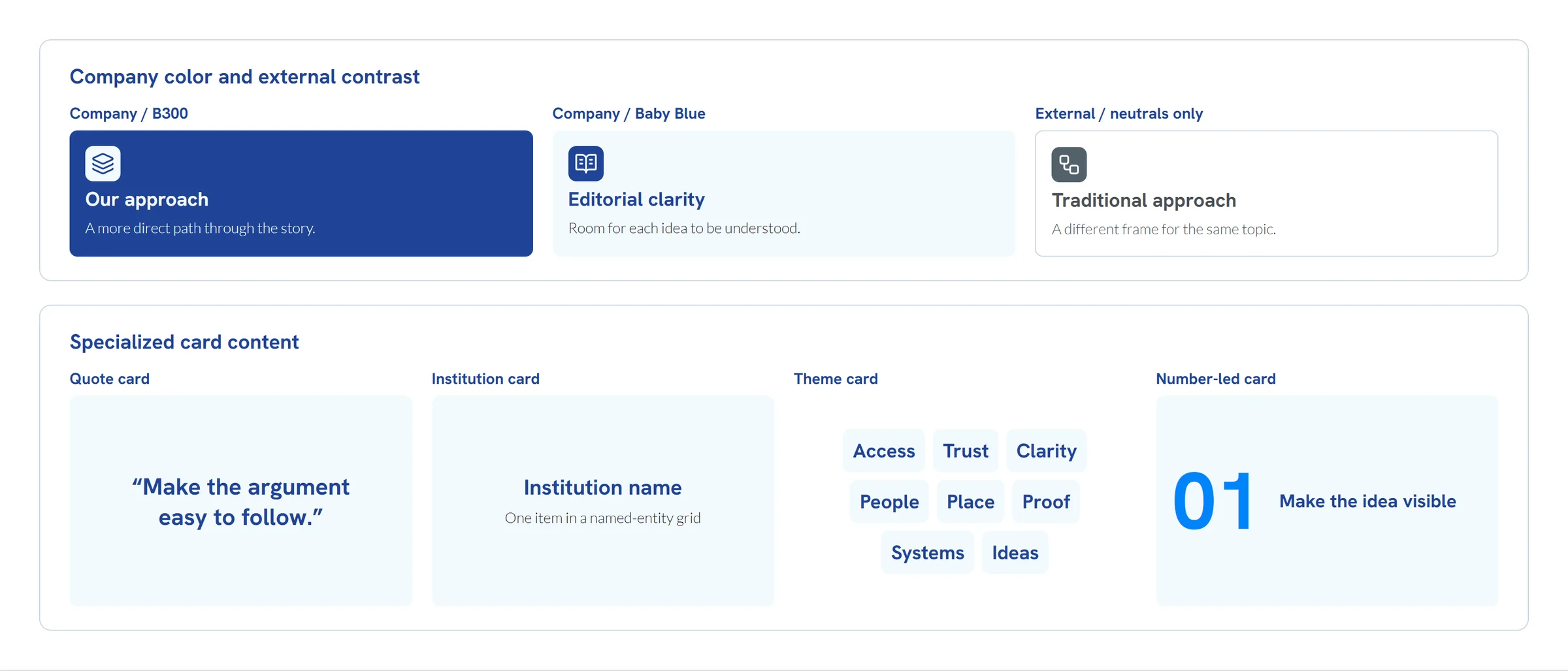
Top row: KoreInside in B300 and Baby Blue, followed by an external counterpoint in neutrals. Bottom row: quote, institution, theme and number-led content. These are content patterns, not additional surface combinations.
Data and number treatments
I proposed three treatments for numbers. An inline figure interrupts a paragraph without leaving the reading column; a mosaic compares several measures; and a large numeral can lead a page. The values shown here are illustrative, not KoreInside metrics.
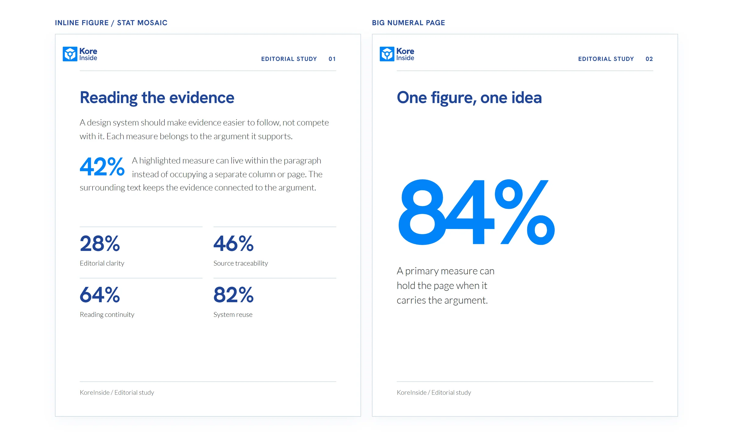
Left: an inline figure stays within the paragraph, with a separate mosaic below for comparison. Right: one large numeral leads the page. The values are illustrative, not KoreInside metrics.
From components to pages
I assembled the same rules into three US Letter page studies: a standard body page, an image-led opening, and a manifesto. The body-page structure had been used; the other two remained proposals. I rebuilt the examples with neutral copy rather than reproducing client pages.
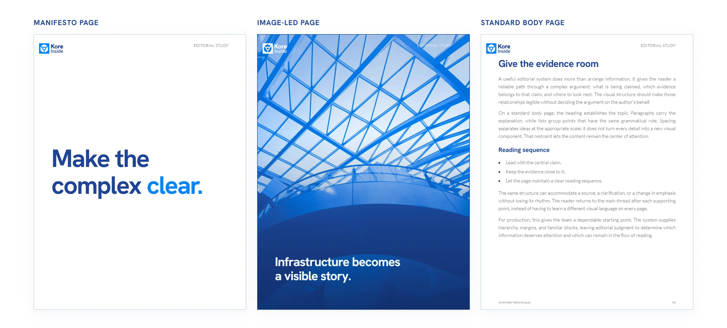
Left to right: manifesto, image-led opening, and standard body page. All elements scale with the brochure page.
Photography placement
I used four snap positions for the inner edge of a photograph: 1/8, 1/6, 1/4, or 1/3 of the page. I tested them as top and bottom bands, full-height side rails, and shorter photos anchored to a manifesto. Page labels stayed fixed; subtle gradients protected contrast where text crossed an image.
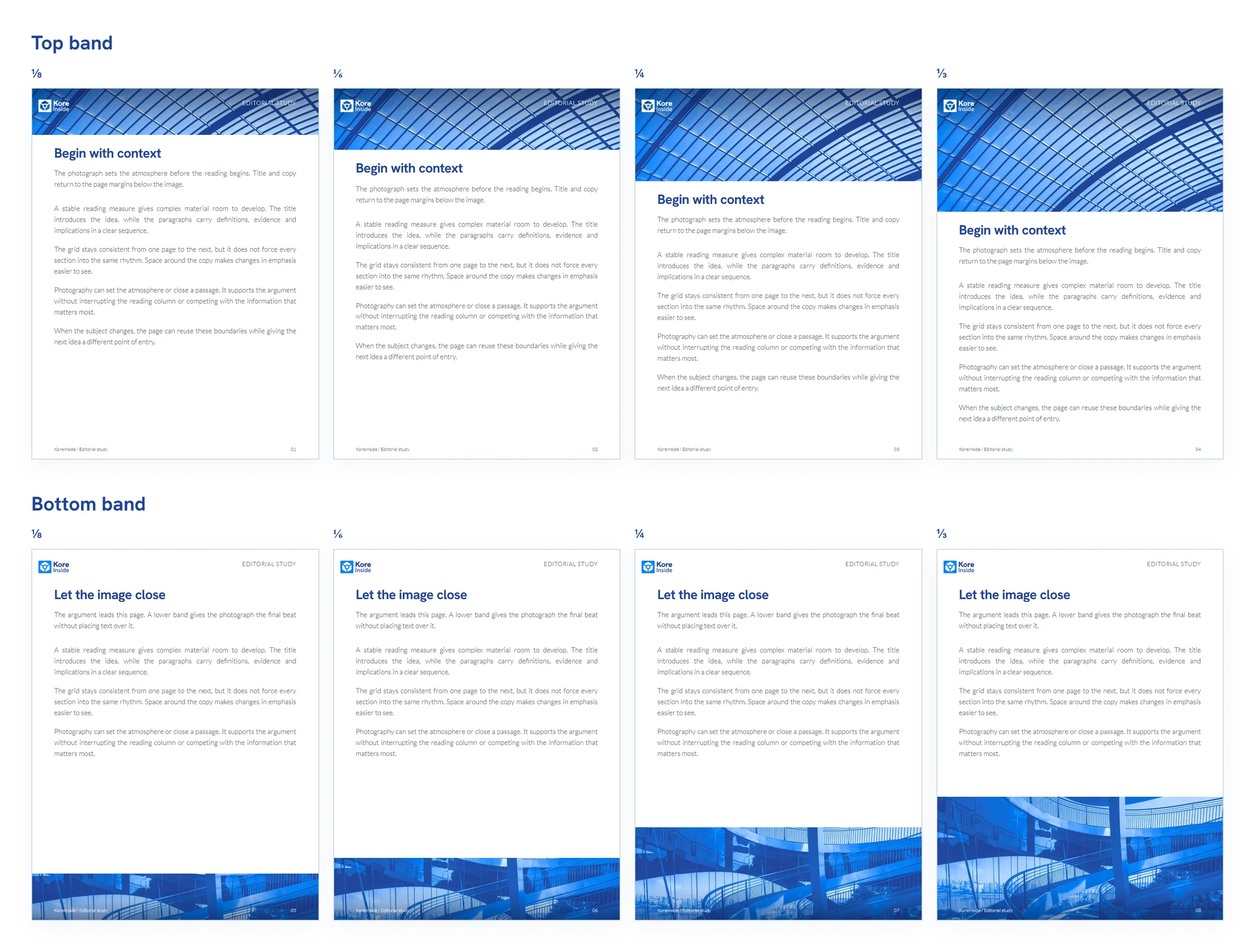
Top row: top bands. Bottom row: bottom bands. From left to right, both rows use ⅛, ⅙, ¼ and ⅓ of page height: 99, 132, 198 and 264 px on the 612 × 792 px source page. Logo, labels and reading margins stay fixed.
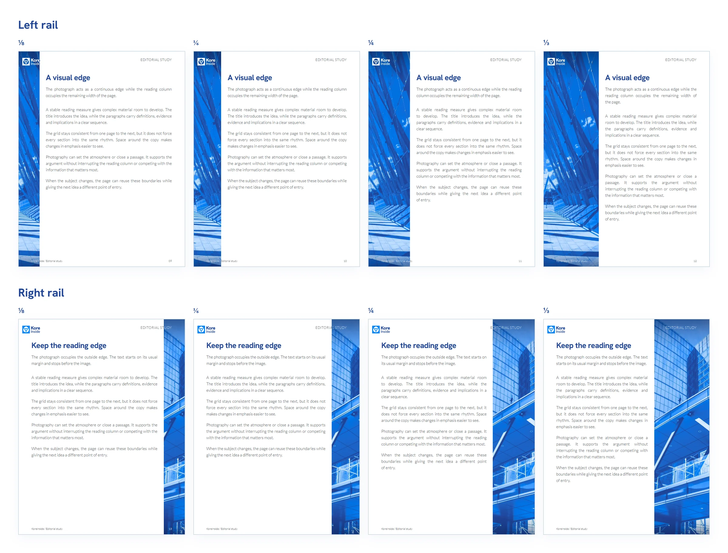
Top row: left rails. Bottom row: right rails. From left to right, both rows use ⅛, ⅙, ¼ and ⅓ of page width: 76.5, 102, 153 and 204 px. Labels stay fixed; local gradients protect contrast where photography crosses them.
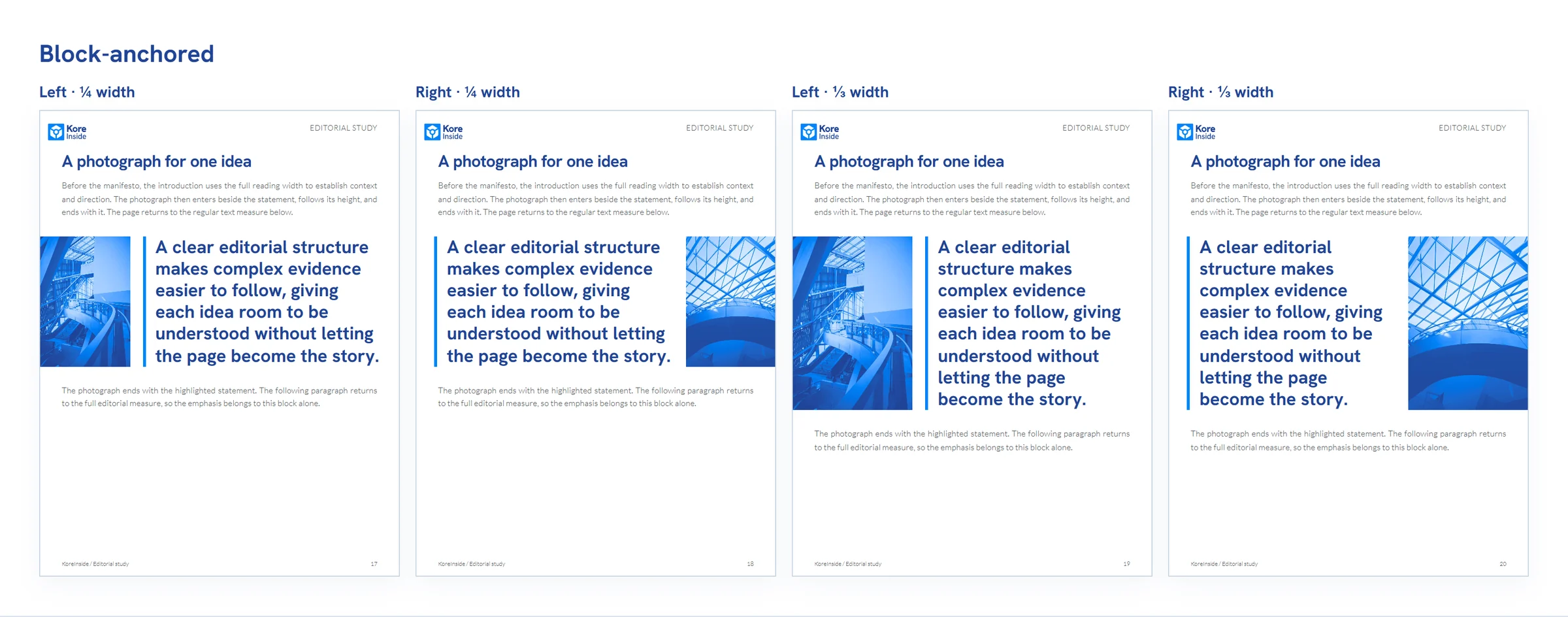
Left to right: left ¼, right ¼, left ⅓ and right ⅓ of page width. Each photograph follows the manifesto’s height, rather than filling the page vertically. Manifesto type is enlarged here to make the relationship visible.
The library across a brochure
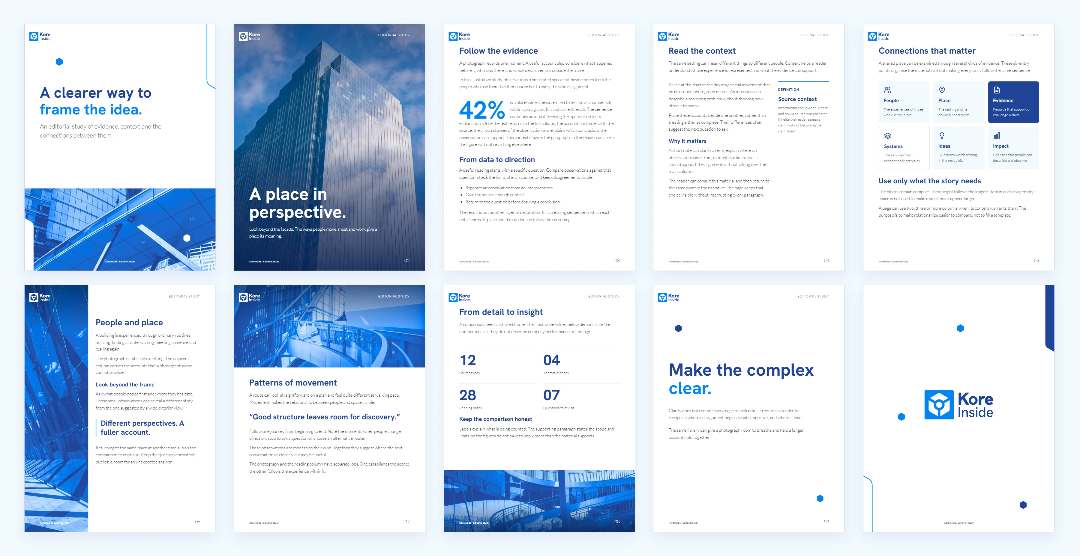
An illustrative ten-page brochure brings the library together, from front cover to back cover.
AI, production, and the tradeoff
I used Claude to compare layouts and record the rules I was choosing. When I tried the full library on routine pieces, it required more decisions than the company’s turnaround allowed. We used it sparingly. We then imported the library into Claude Design and began producing materials there. I reviewed the outputs and adjusted them against the library’s rules.
KoreInside’s visual identity, logos, and brand assets belong to Kore Inc & Kore US Inc. Every brochure page shown in this case is an illustrative mockup with placeholder editorial copy; none reproduces client-authored page content. © 2016-2026 Kore Inc & Kore US Inc. All Rights Reserved.